Graphic Design with ggplot2
Cara Membuat Visualisasi yang Menarik di R

{ggplot2} adalah library di R untuk membuat grafik secara mudah dan terstruktur,
berdasarkan konsep “The Grammar of Graphics” (Wilkinson, 2005).

Illustration by Allison Horst

ggplot2 Examples featured on ggplot2.tidyverse.org

Illustration by Allison Horst


`geom_smooth()` using formula = 'y ~ x'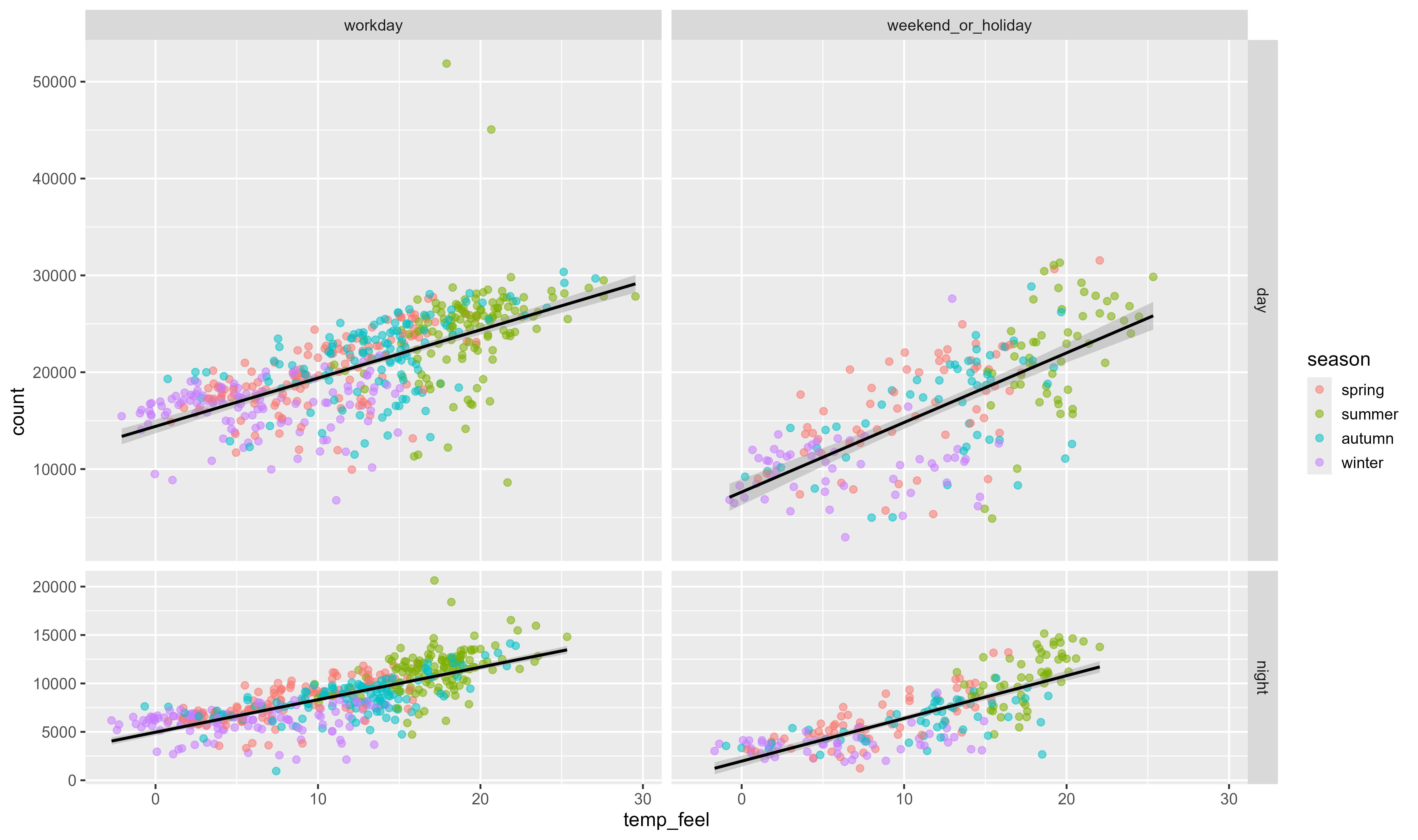
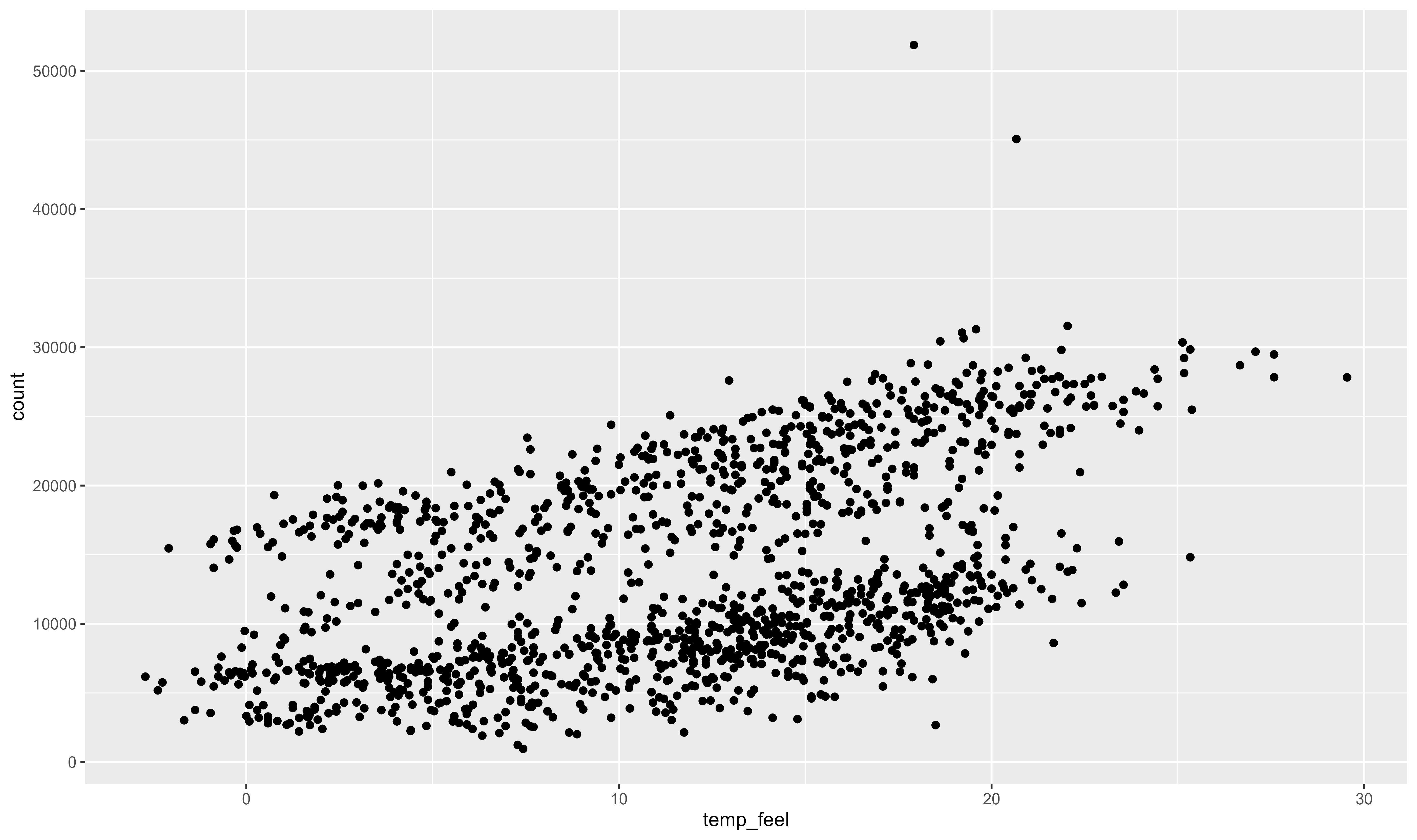
ggplot(bikes, aes(temp_feel, count)) +
  geom_point(
    aes(color = season),
    size = 2.2, alpha = .55
  ) +
  geom_smooth(
    aes(group = day_night),
    method = "lm", color = "black"
  ) +
  ## Membuat beberapa grafik dan berukuran proporsional terhadap data
  facet_grid(
    day_night ~ is_workday,
    scales = "free_y", space = "free_y"
)`geom_smooth()` using formula = 'y ~ x'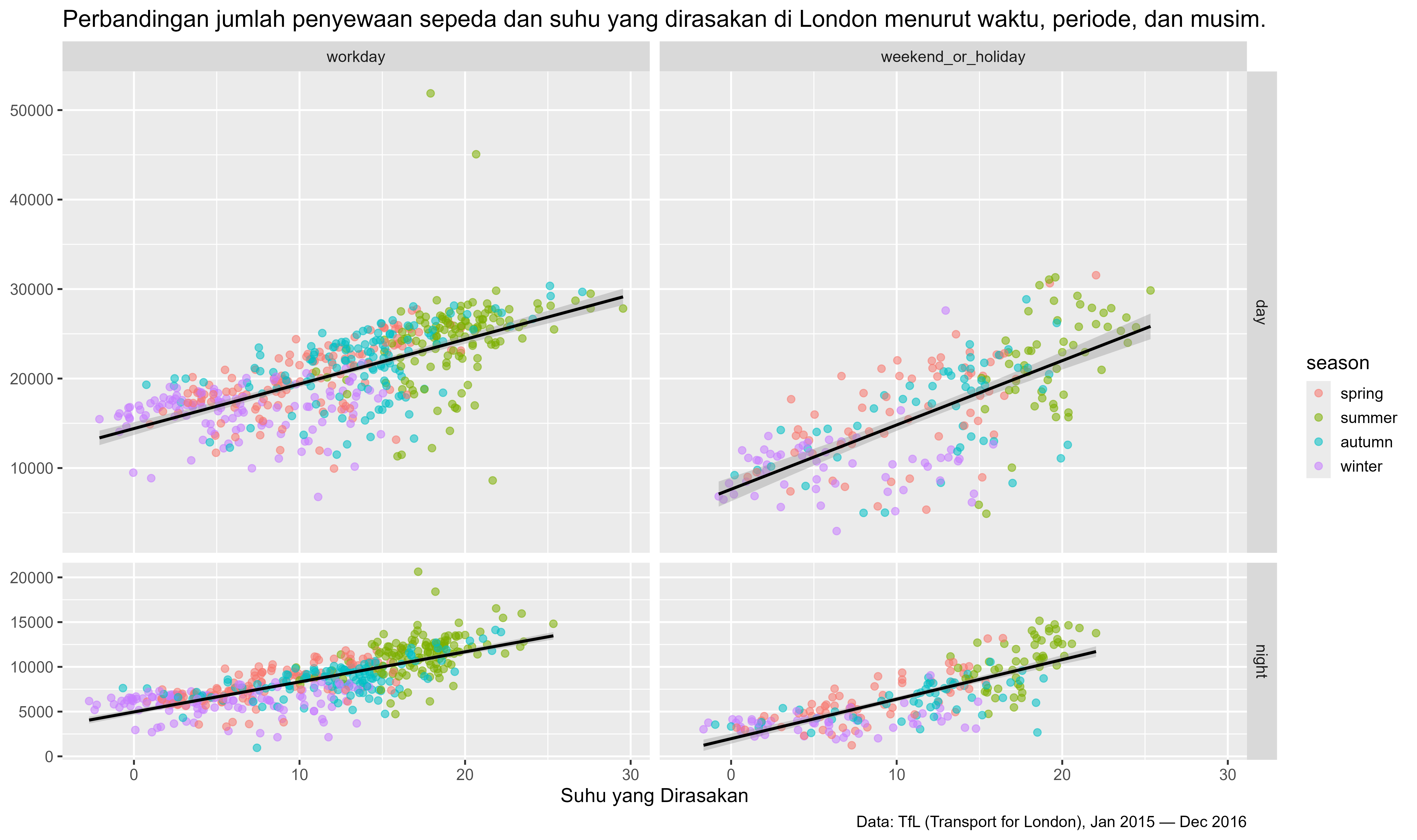
ggplot(bikes, aes(temp_feel, count)) +
  geom_point(
    aes(color = season),
    size = 2.2, alpha = .55
  ) +
  geom_smooth(
    aes(group = day_night),
    method = "lm", color = "black"
  ) +
  facet_grid(
    day_night ~ is_workday,
    scales = "free_y", space = "free_y"
  ) +
  ## add labels + titles
  labs(
    x = "Suhu yang Dirasakan", y = NULL,
    caption = "Data: TfL (Transport for London), Jan 2015 — Dec 2016",
    title = "Perbandingan jumlah penyewaan sepeda dan suhu yang dirasakan di London menurut waktu, periode, dan musim."
)`geom_smooth()` using formula = 'y ~ x'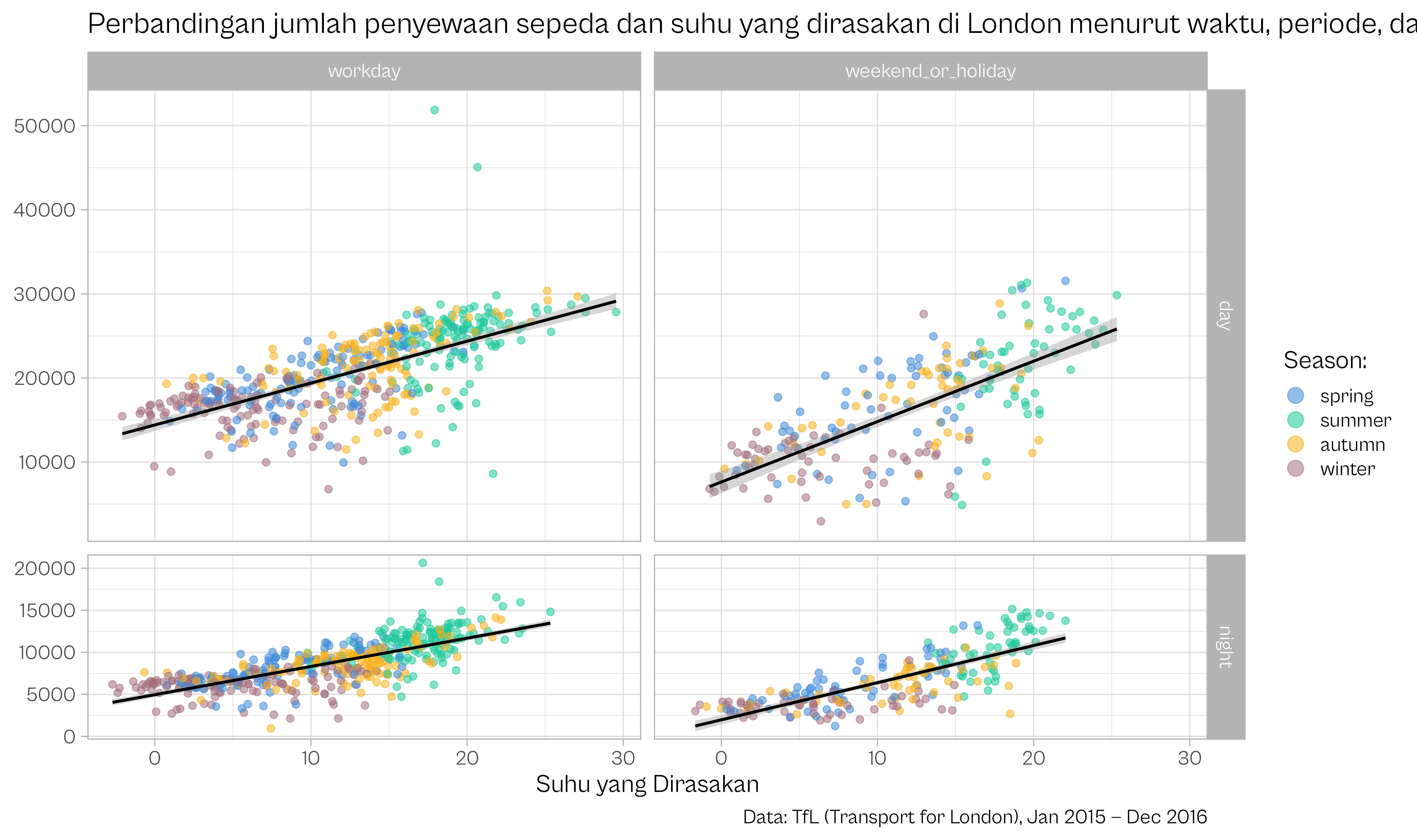
ggplot(bikes, aes(temp_feel, count)) +
  geom_point(
    aes(color = season),
    size = 2.2, alpha = .55
  ) +
  geom_smooth(
    aes(group = day_night),
    method = "lm", color = "black"
  ) +
  facet_grid(
    day_night ~ is_workday,
    scales = "free_y", space = "free_y"
  ) +
  ## Tambahkan warna kustom dan atur gaya legenda
  scale_color_manual(
    values = c("#3c89d9", "#1ec99b", "#F7B01B", "#a26e7c"), name = "Season:",
    guide = guide_legend(override.aes = list(size = 5))
  ) +
  labs(
    x = "Suhu yang Dirasakan", y = NULL,
    caption = "Data: TfL (Transport for London), Jan 2015 — Dec 2016",
    title = "Perbandingan jumlah penyewaan sepeda dan suhu yang dirasakan di London menurut waktu, periode, dan musim."
  ) +
  ## Gunakan tema dan jenis huruf yang berbeda
theme_light(base_size = 18, base_family = "Cabinet Grotesk")`geom_smooth()` using formula = 'y ~ x'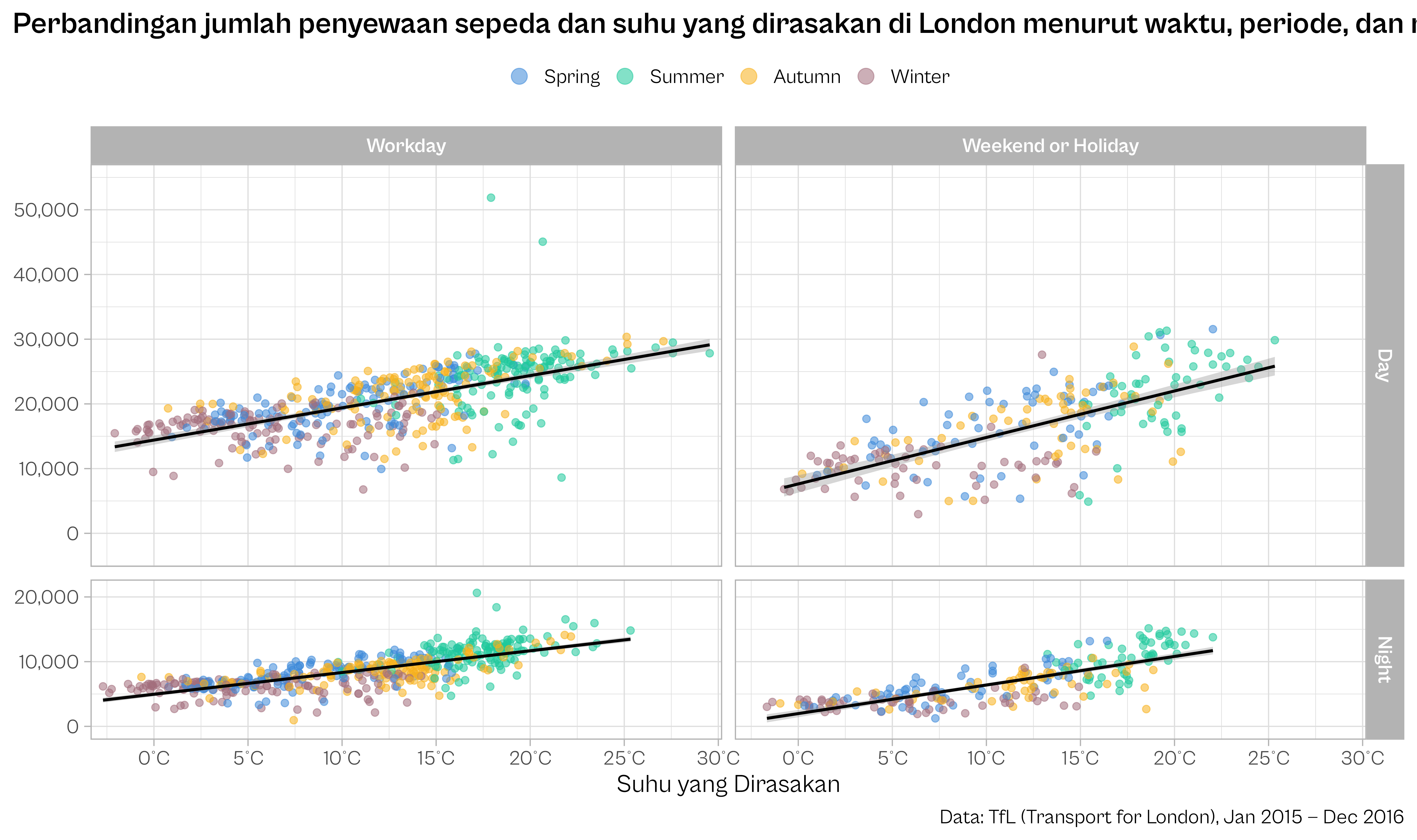
## Kode untuk mengatur teks pada label facet
codes <- c(
  workday = "Workday",
  weekend_or_holiday = "Weekend or Holiday"
)

ggplot(bikes, aes(temp_feel, count)) +
  ## format seasons
  geom_point(
    aes(color = forcats::fct_relabel(season, stringr::str_to_title)),
    size = 2.2, alpha = .55
  ) +
  geom_smooth(
    aes(group = day_night),
    method = "lm", color = "black"
  ) +
  ## Memformat teks pada label facet
  facet_grid(
    day_night ~ is_workday,
    scales = "free_y", space = "free_y",
    labeller = labeller(
      day_night = stringr::str_to_title,
      is_workday = codes
    )
  ) +
  ## menyesuaikan tampilan sumbu X
  scale_x_continuous(
    expand = c(.02, .02),
    breaks = 0:6*5, labels = function(x) paste0(x, "°C")
  ) +
  ## menyesuaikan tampilan sumbu Y
  scale_y_continuous(
    expand = c(.1, .1), limits = c(0, NA),
    breaks = 0:5*10000, labels = scales::comma_format()
  ) +
  scale_color_manual(
    values = c("#3c89d9", "#1ec99b", "#F7B01B", "#a26e7c"), name = NULL,
    guide = guide_legend(override.aes = list(size = 5))
  ) +
  labs(
    x = "Suhu yang Dirasakan", y = NULL,
    caption = "Data: TfL (Transport for London), Jan 2015 — Dec 2016",
    title = "Perbandingan jumlah penyewaan sepeda dan suhu yang dirasakan di London menurut waktu, periode, dan musim."
  ) +
  theme_light(
    base_size = 18, base_family = "Cabinet Grotesk"
  ) +
  ## Penyesuaian tema
  theme(
    plot.title.position = "plot",
    plot.caption.position = "plot",
    plot.title = element_text(face = "bold"),
    strip.text = element_text(face = "bold"),
    legend.position = "top"
)`geom_smooth()` using formula = 'y ~ x'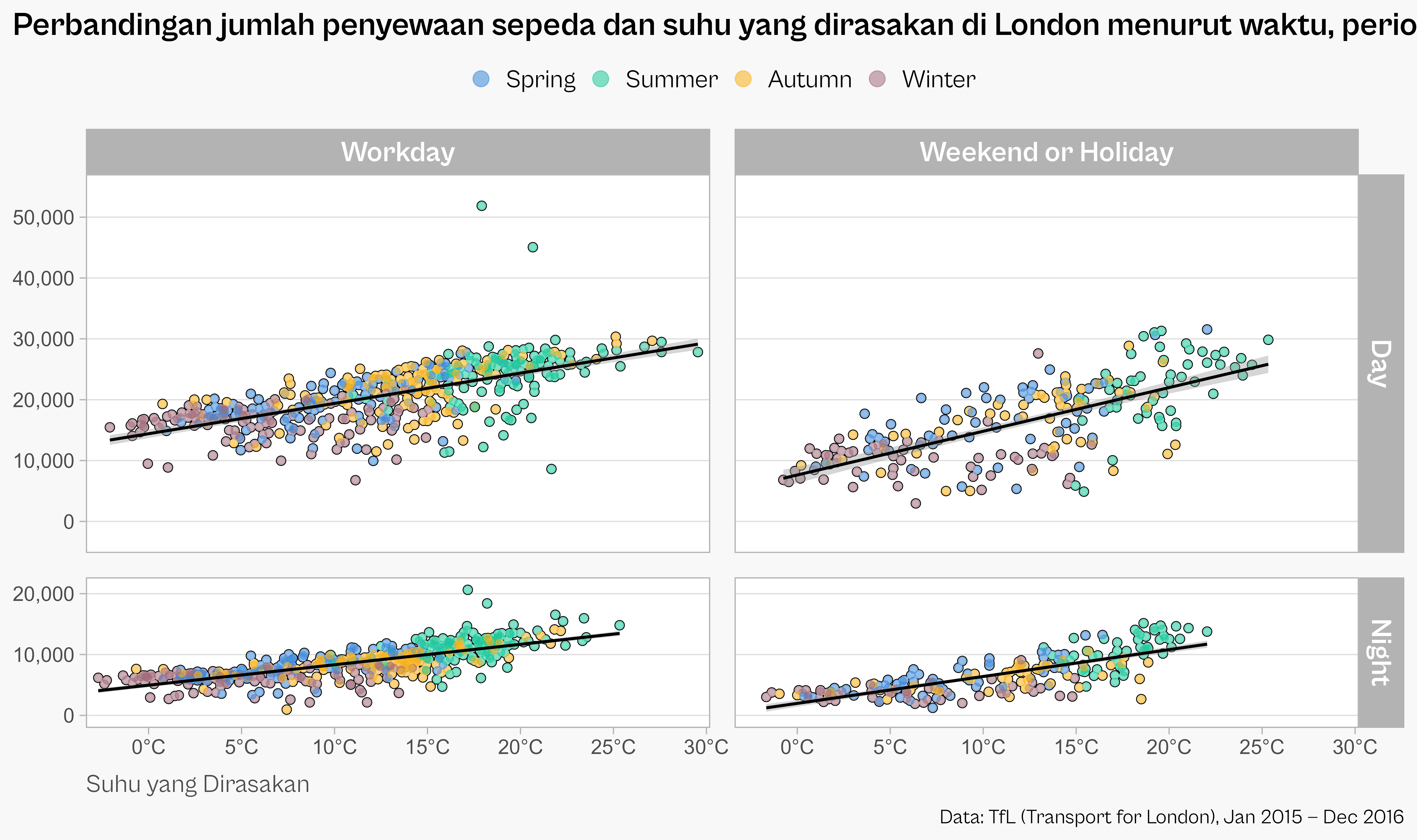
codes <- c(
  workday = "Workday",
  weekend_or_holiday = "Weekend or Holiday"
)

ggplot(bikes, aes(temp_feel, count)) +
  ## Menambahkan garis tepi (outline) pada titik
  geom_point(
    color = "black", fill = "white",
    shape = 21, size = 2.8
  ) +
  ### Latar belakang titik yang tidak transparan
  geom_point(
    color = "white", size = 2.2
  ) +
  ## Titik berwarna dan semi-transparan
  geom_point(
    aes(color = forcats::fct_relabel(season, stringr::str_to_title)),
    size = 2.2, alpha = .55
  ) +
  geom_smooth(
    aes(group = day_night), method = "lm", color = "black"
  ) +
  facet_grid(
    day_night ~ is_workday,
    scales = "free_y", space = "free_y",
    labeller = labeller(
      day_night = stringr::str_to_title,
      is_workday = codes
    )
  ) +
  scale_x_continuous(
    expand = c(.02, .02),
    breaks = 0:6*5, labels = function(x) paste0(x, "°C")
  ) +
  scale_y_continuous(
    expand = c(.1, .1), limits = c(0, NA),
    breaks = 0:5*10000, labels = scales::comma_format()
  ) +
  scale_color_manual(
    values = c("#3c89d9", "#1ec99b", "#F7B01B", "#a26e7c"), name = NULL,
    guide = guide_legend(override.aes = list(size = 5))
  ) +
  labs(
    x = "Suhu yang Dirasakan", y = NULL,
    caption = "Data: TfL (Transport for London), Jan 2015 — Dec 2016",
    title = "Perbandingan jumlah penyewaan sepeda dan suhu yang dirasakan di London menurut waktu, periode, dan musim."
  ) +
  theme_light(
    base_size = 18, base_family = "Cabinet Grotesk"
  ) +
  ## Penyesuaian tema secara lebih detail
  theme(
    plot.title.position = "plot",
    plot.caption.position = "plot",
    plot.title = element_text(face = "bold", size = rel(1.3)),
    axis.text = element_text(family = "Tabular"),
    axis.title.x = element_text(hjust = 0, color = "grey30", margin = margin(t = 12)),
    strip.text = element_text(face = "bold" , size = rel(1.15)),
    panel.grid.major.x = element_blank(),
    panel.grid.minor = element_blank(),
    panel.spacing = unit(1.2, "lines"),
    legend.position = "top",
    legend.text = element_text(size = rel(1)),
    ## Menyesuaikan dengan tampilan atau latar belakang slide
    legend.key = element_rect(color = "#f8f8f8", fill = "#f8f8f8"),
    legend.background = element_rect(color = "#f8f8f8", fill = "#f8f8f8"),
    plot.background = element_rect(color = "#f8f8f8", fill = "#f8f8f8")
  )